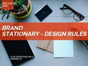
Business Stationary Design Rules

To make your branding strategy stronger you have to pay a lot of attention to your business stationary, they are the most widely visible brand elements. It is the key element which helps to gain recognition of your business among your prospective customers. Be it small or a mid-sized business, maintaining a consistent brand image throughout your marketing materials can bring about a lot of difference.
The smallest of the details like the quality of the paper or your letterhead, the color choice of your business card or the logo placement – everything in your business stationary design matters the most to create the right impression. It’s like your clients gets the first impression of you before even meeting you. So design it well!
Less is more – Mind it
Custom design is the trend that’s catching up to create a long lasting image and personality of the business. But remember the key point – keep it simple. You don’t have to show all your creativity when designing it, just a glimpse of its potential is enough.
Mind the cleanliness
Your branding on business stationary should create an impression but not by being loud or clumsy. The key message can get lost if you are trying to convey too much. A design that is too cluttered will distract clients from noticing the important things on the stationery, such as your contact information and logo identity. The message should be short and crystal clear.
Remember, it is only a contact card not a directory/website of your business. Sometimes, business owners want to say it all in a small card – that is not recommended.
Mind your communication?
Now the mandates like name, address, phone number, email address, or other important information (such as registration numbers) etc. should foremost come as contact details and the design should allow easy readability. Also, it’s worth reconsidering what contact information you provide to your clients. Don’t print a fax number until you’ve checked how many faxes you actually got last year.
Since social media platforms are in, consider sharing information about your social media profiles. And make sure only those profiles are shared on your business card which are regularly updated and responded to.
Mind your quality – It matters
Creating an impression in the very first go doesn’t come from the logo placement or colour scheme. It comes from the first touch of the paper quality. Choosing high-quality paper for your business stationery can make it feel more professional.
Also the choice of paper should also match the business type and what it wants to convey and even the target audience.
Mind the color scheme
You will have to rethink the color scheme of your overall stationary design. Remember rainbow and monotone both won’t work. Think carefully about your branding colors, and how you can use them in the individual stationery designs. You should go with complementary colors for the paper, as they tend to look best together.
Font selection – Mind the type and size
Font selection should be done very carefully as it should express professionalism. It should be easy to read, the style shouldn’t be funky or informal. Consumers will be looking for text that is easy on the eye that can portray information clearly and efficiently.
Font size, color, type and text alignment are a must to manage. If there is a miss in any of those – the whole effort looks silly!
Now let us share some of the, Business Stationary Must Haves’
Letterhead & With Compliments Slips
Make sure that your letters and with compliments slips appeal to your customers by having them branded with your company details. It certainly adds to the weight to the brand.
Envelopes
When sending correspondence to your customers make sure that you make an impression from the beginning with envelopes branded with your company details.
Notepads
Keep your company name on top. That way your brand will gain visibility and attention. It is also a great brand recall strategy for your customers & stakeholders.
Business Cards
A very cost effective marketing piece yet very effective. Choose them right.
Brand Effectively. Get the brand collaterals right.

2 Comments
Brand collateral are important and I think a business should have them professionally made from start unless You want to look unstable, unfocused and a business which can close its operations any time soon. Today one needs to tell about their company to all the stake holders from employees to potential clients and the success depends a lot on how well you communicate. These brand identity plays a significant role then.
/
Yes, very rightly mentioned – the branding in design is required from the start and also the business stationary is at times the first impression and that matters most! The collateral are indeed the first face of Brand Voice.
/